Hi, I am Allison Smith, a Lead Designer with over 18 years of experience as a Designer and over 12 years as a UX UI | Product Design Expert!
I have also taught Art + Design at all levels; focusing on corporate design, digital design and fine art, impacting students both professionally and personally.
I act as a full-service digital product agency, specializing in web and mobile applications, and digital design, while leading E2E product lifecycles where applicable. I have had the opportunity to partner with companies at every stage of the product lifecycle—from early discovery and strategy through UX/UI design, prototyping, launch, and continuous optimization.
I love collaborating with teams and educating all groups on design and how we can make an impact with design.
Additionally I use my background in Education to educate and teach design, not only on the high school and college levels but for Product Teams, Stakeholders and Junior Designers.
I am in the process of redoing my website, if you are interested in learning more about my skill sets, and background kinly email me at: asmith@smithdezign.com. I look forward to working with you and your team.
SOME OF MY CLIENTS


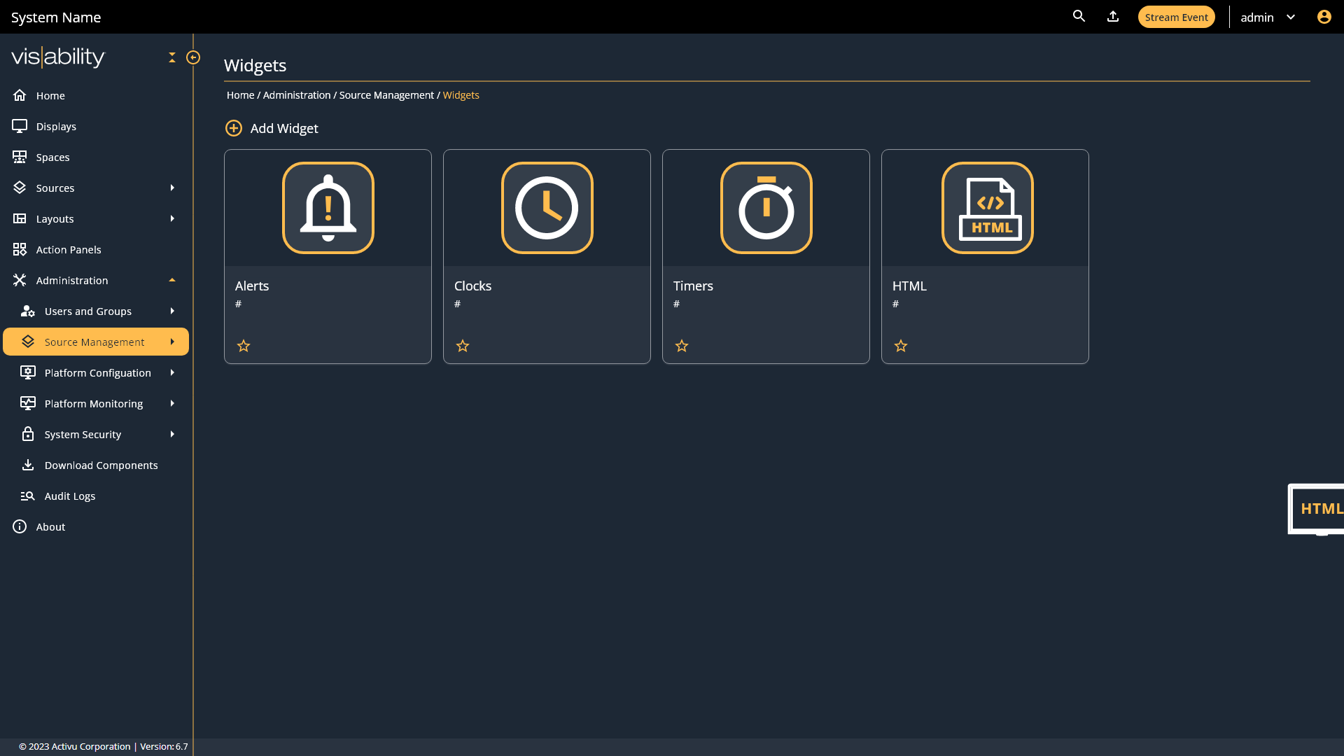
Working as Lead Designer for a transformation of an existing web application for Operations in the EU. Increasing business revenue and user efficiency by over 55% through redesign based on user needs.

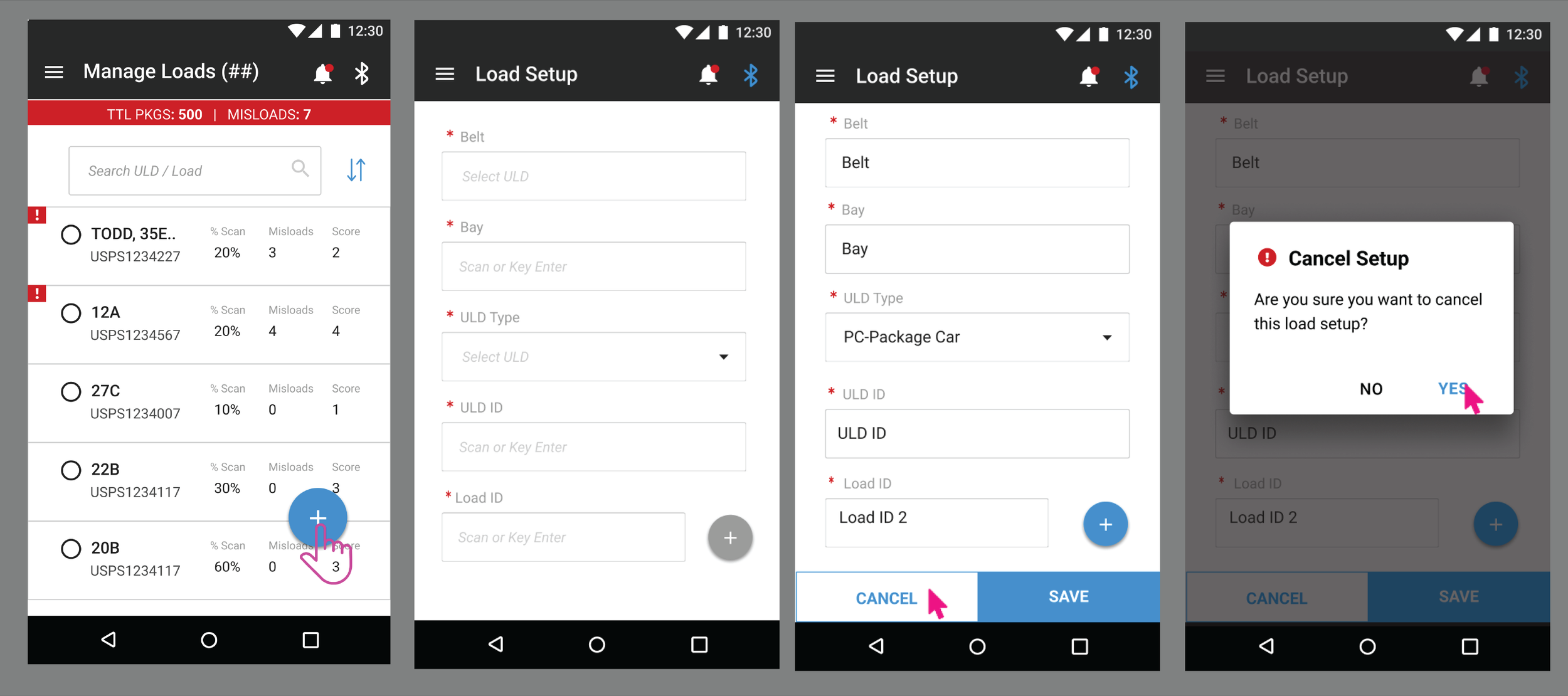
Working as Lead Designer for a new pilot application for UPS for mobile scan and delivery using Smart Technology.
Conducted both research and design with the ability to increase business revenue upto 40%.


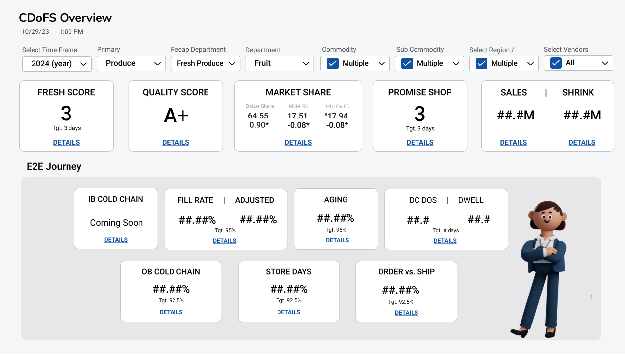
Working as Lead Designer for a Kroger Company. My role was to help build out their new Fresh Initiative Dashboard to help internal users be able to make quick fast business decisions.


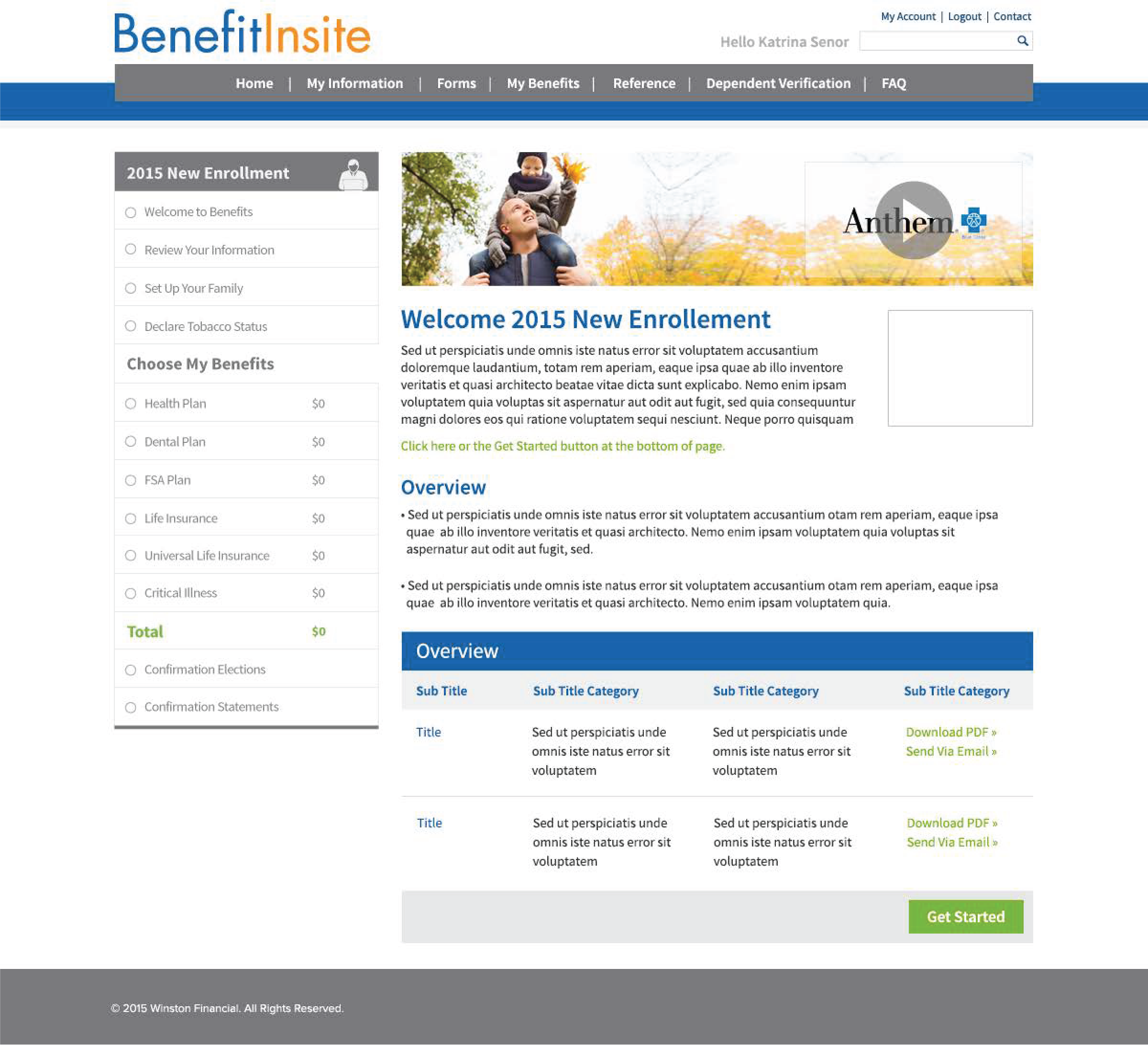
Winston Benefits Insurance hired us to act as their Lead Design team to transfer their existing product into a new revised product catering to customer needs.


Approach
Success comes from aligning strategy with collaboration throughout the entire product lifecycle.
My process emphasizes working closely with client members, ensuring shared understanding from discovery through delivery.
By creating clear research and design strategies, we help teams connect on UX vision and goals—balancing user needs with business objectives. This alignment is what ultimately drives meaningful impact and product success.

What my clients are saying
"Our team learned how to think like designers, with consideration to our users and business needs giving the team the ability to meet deadlines and ensure best user experience is developed."
Andrea Dunn, Product Manager, UPS
"Alli has helped us understand design both in general and how to make the data more sensible to our business users. The impact has increased usability and business revenue by over 50%.”
Uriel Munar, Product Manager, Kroger